Neff Cycle Service
Logo Design & Identity
Collaborative Moodboard
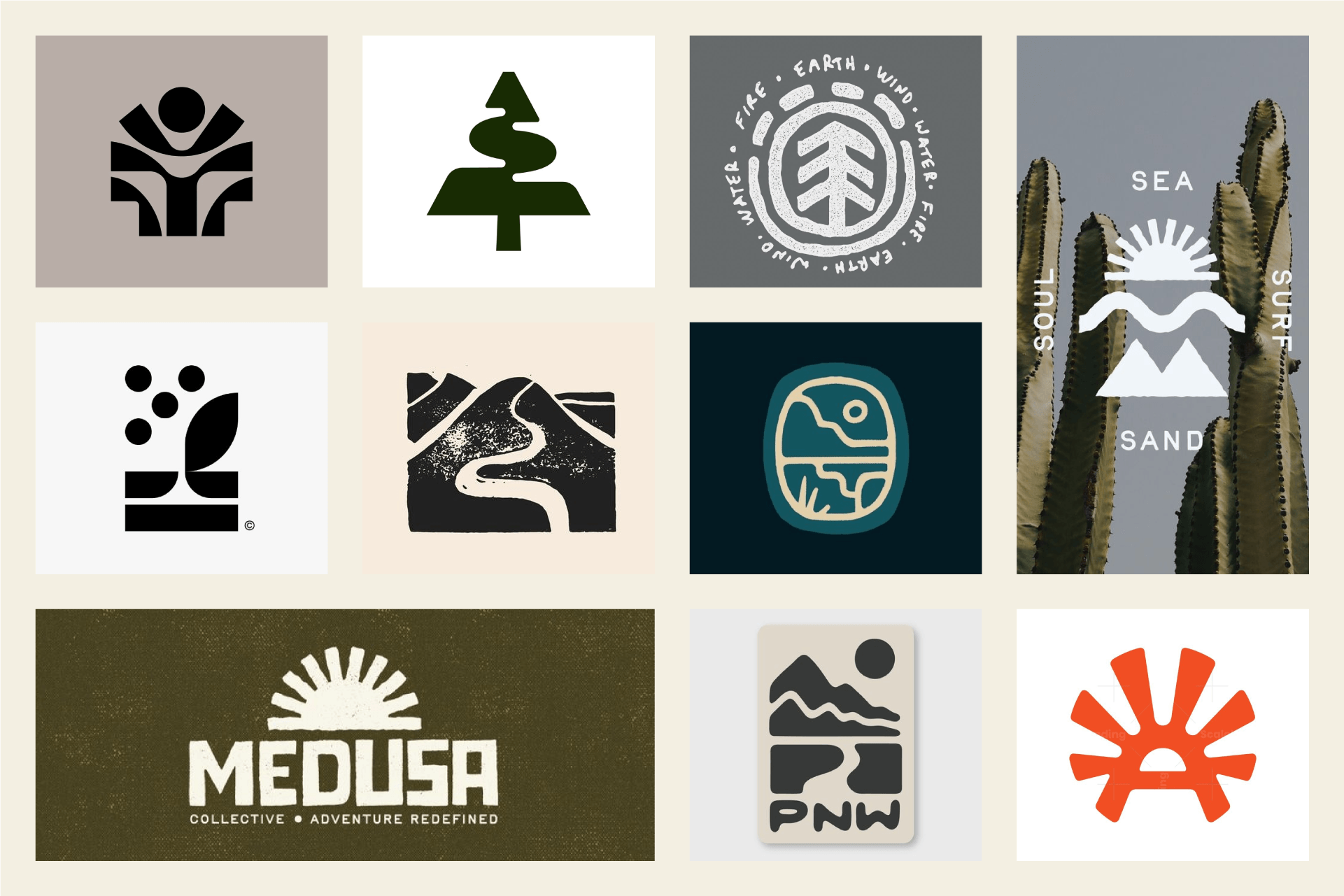
A shared Pinterest board was created to kick off the project and establish the direction. The benefit of the collaborative board is the ability to revisit and redirect as needed.
In this case, the board started with clean, symmetrical, geometric, simple shapes. As the process took shape, the moodboard shifted to lean into more organically inspired shapes.
Putting it All Together
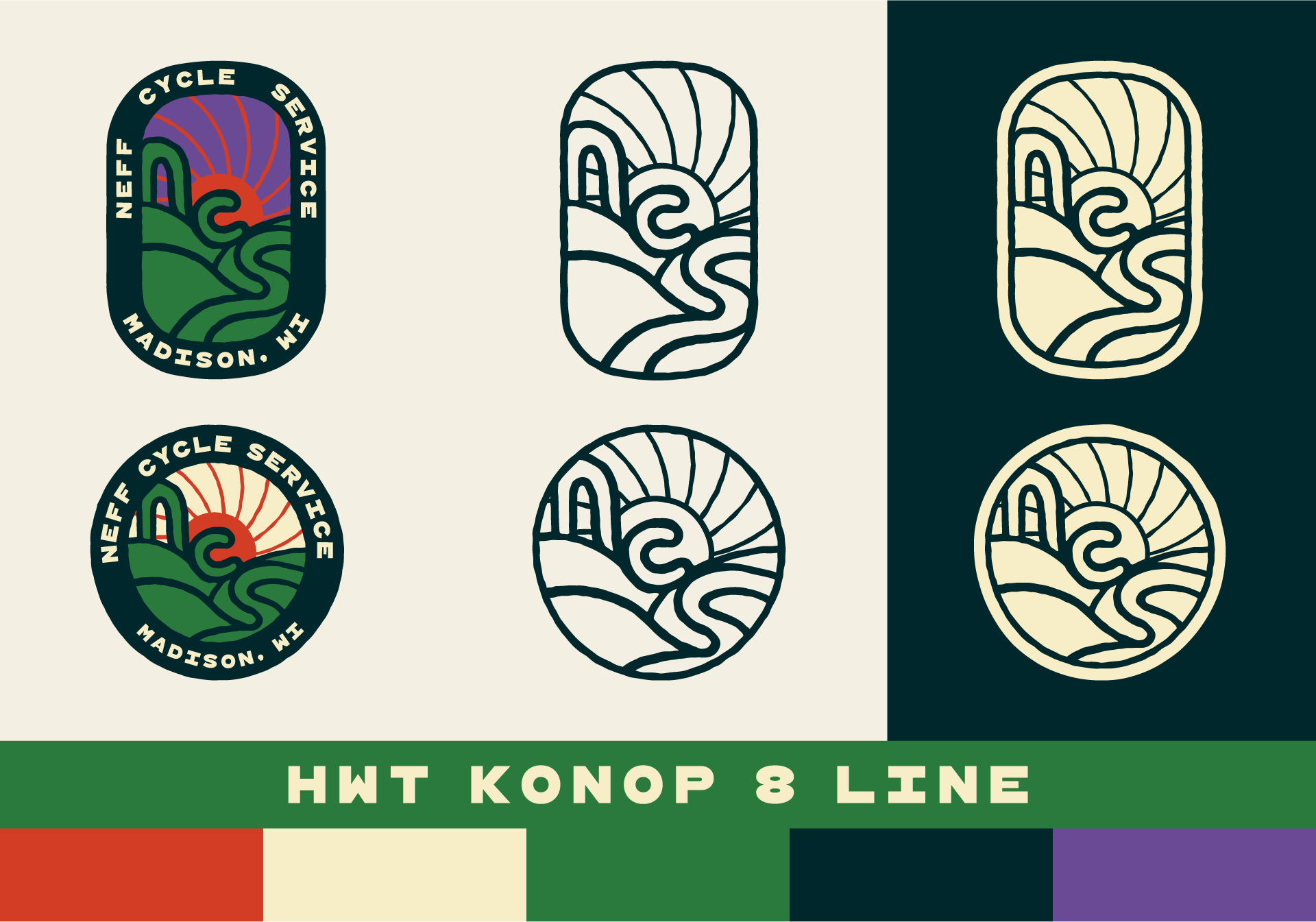
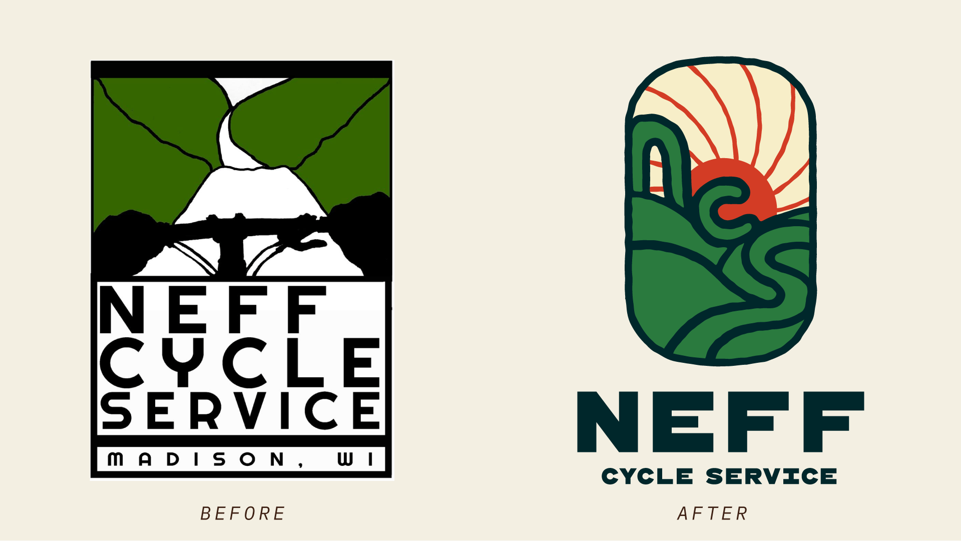
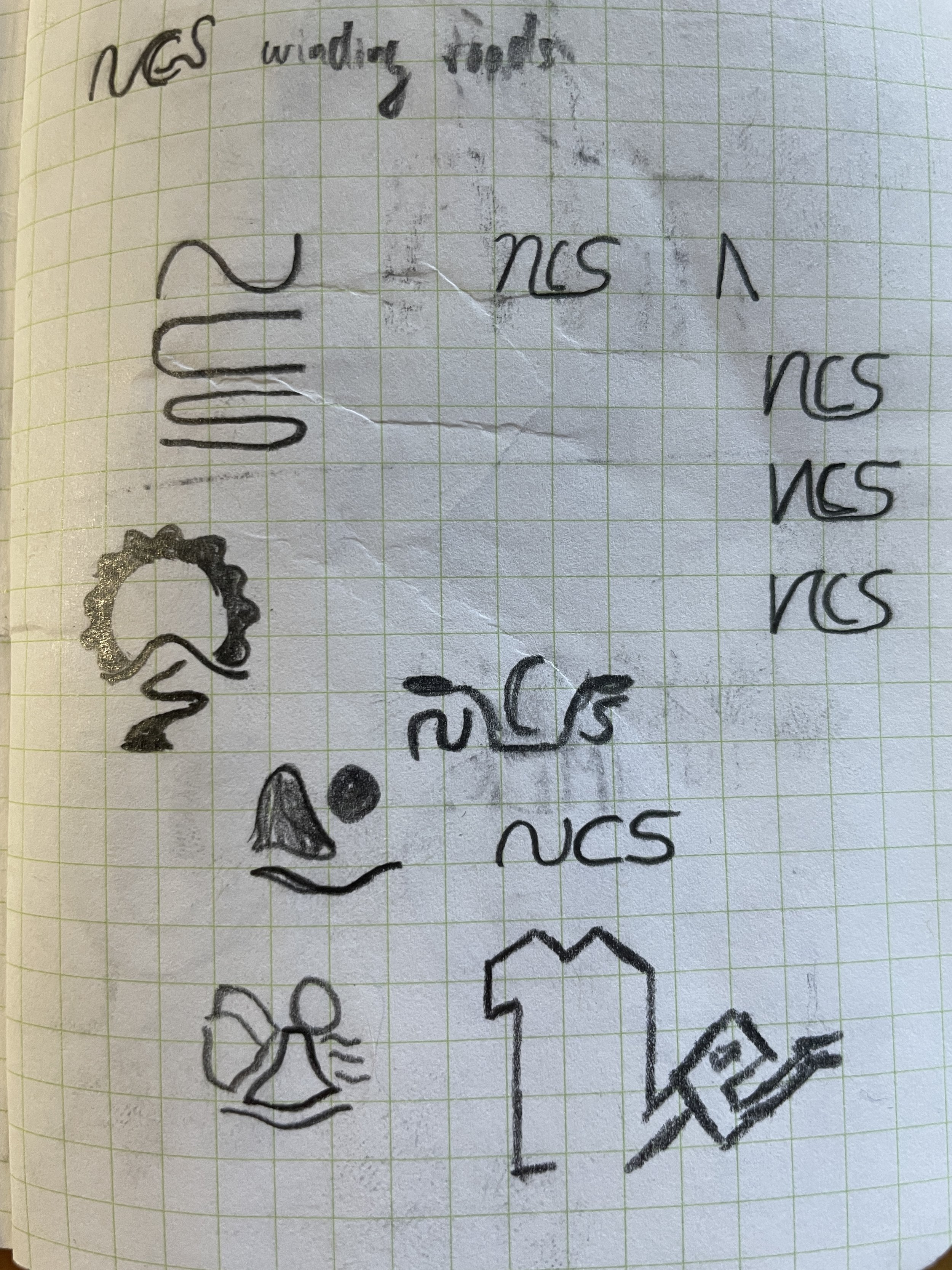
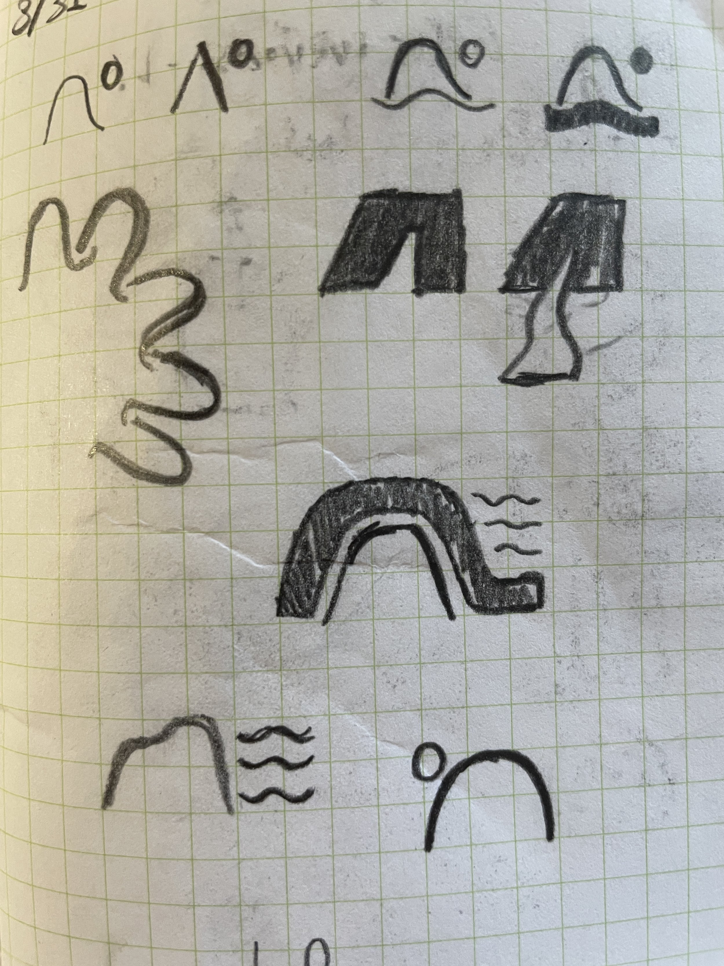
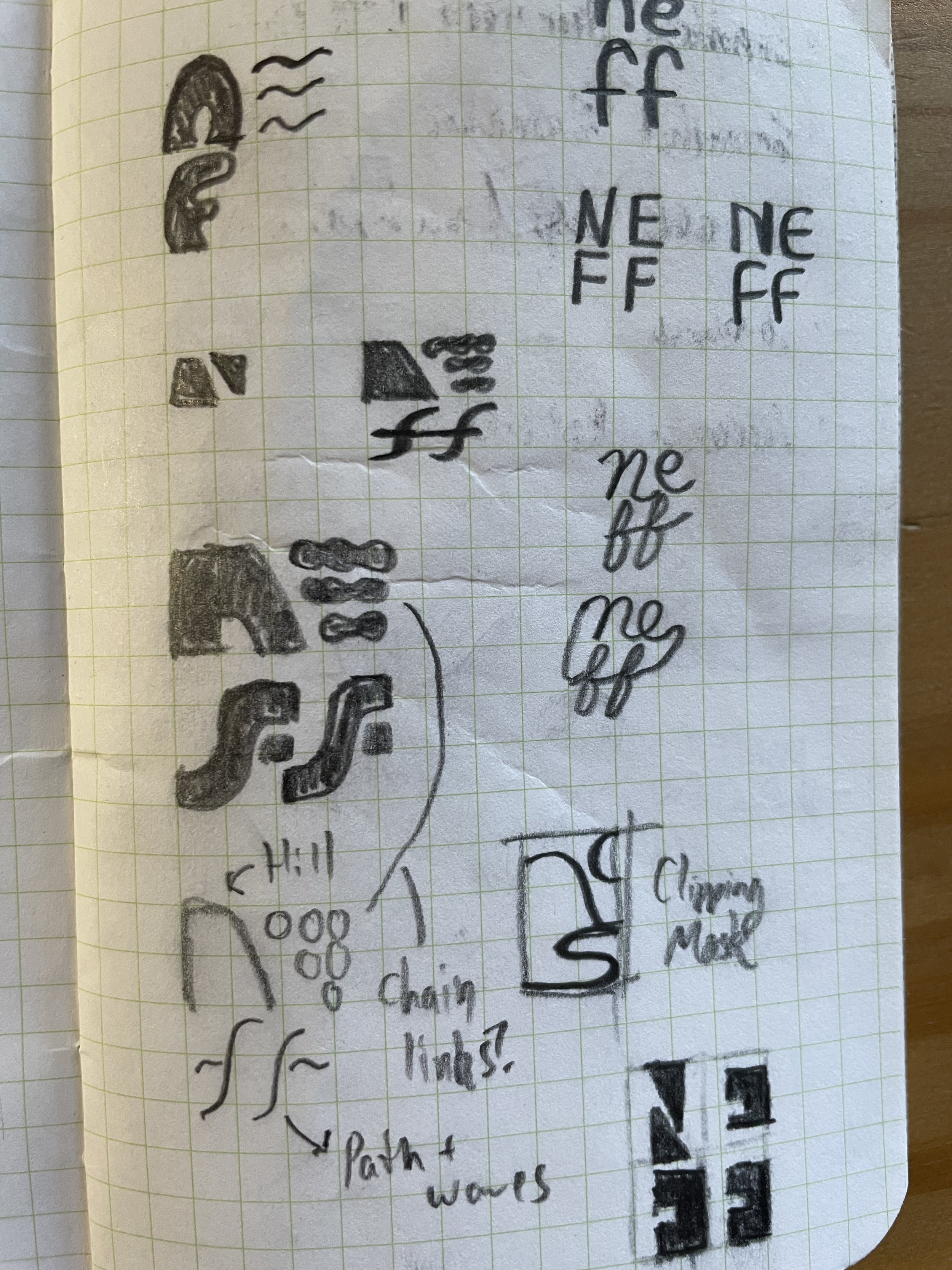
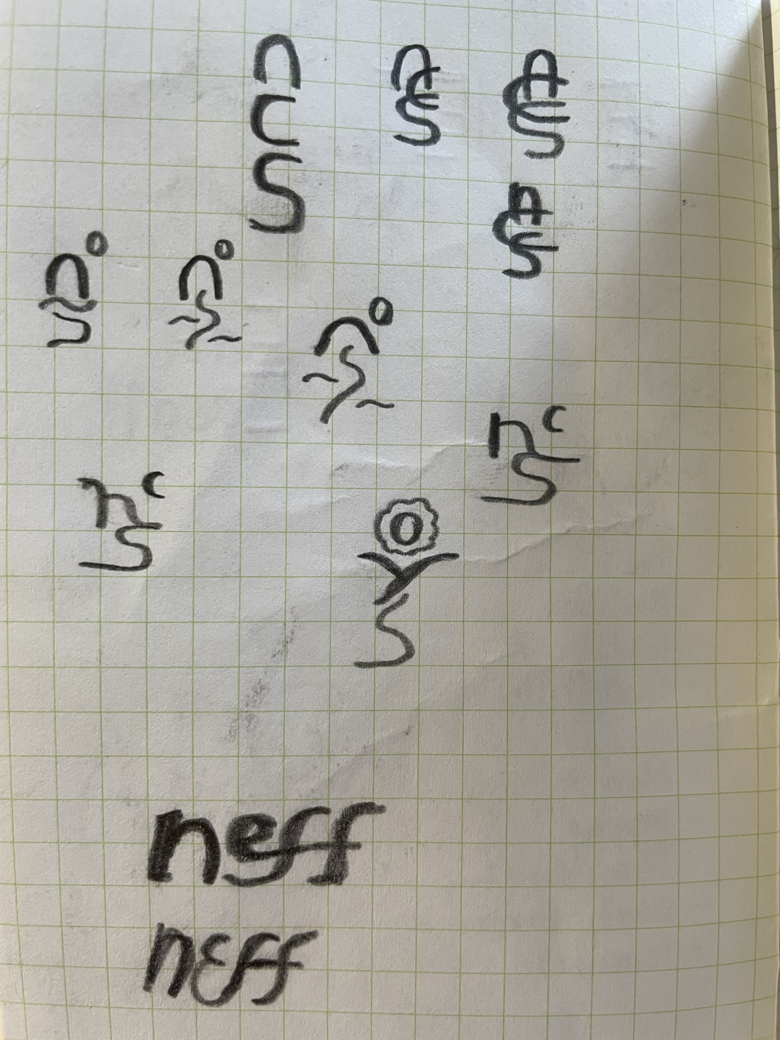
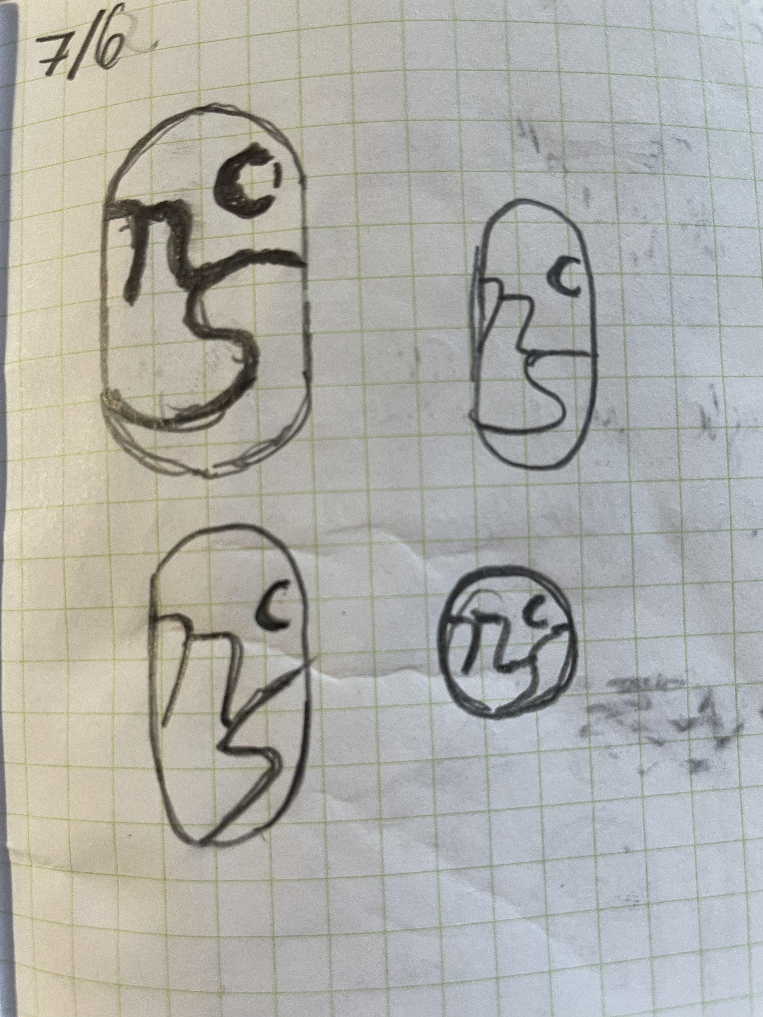
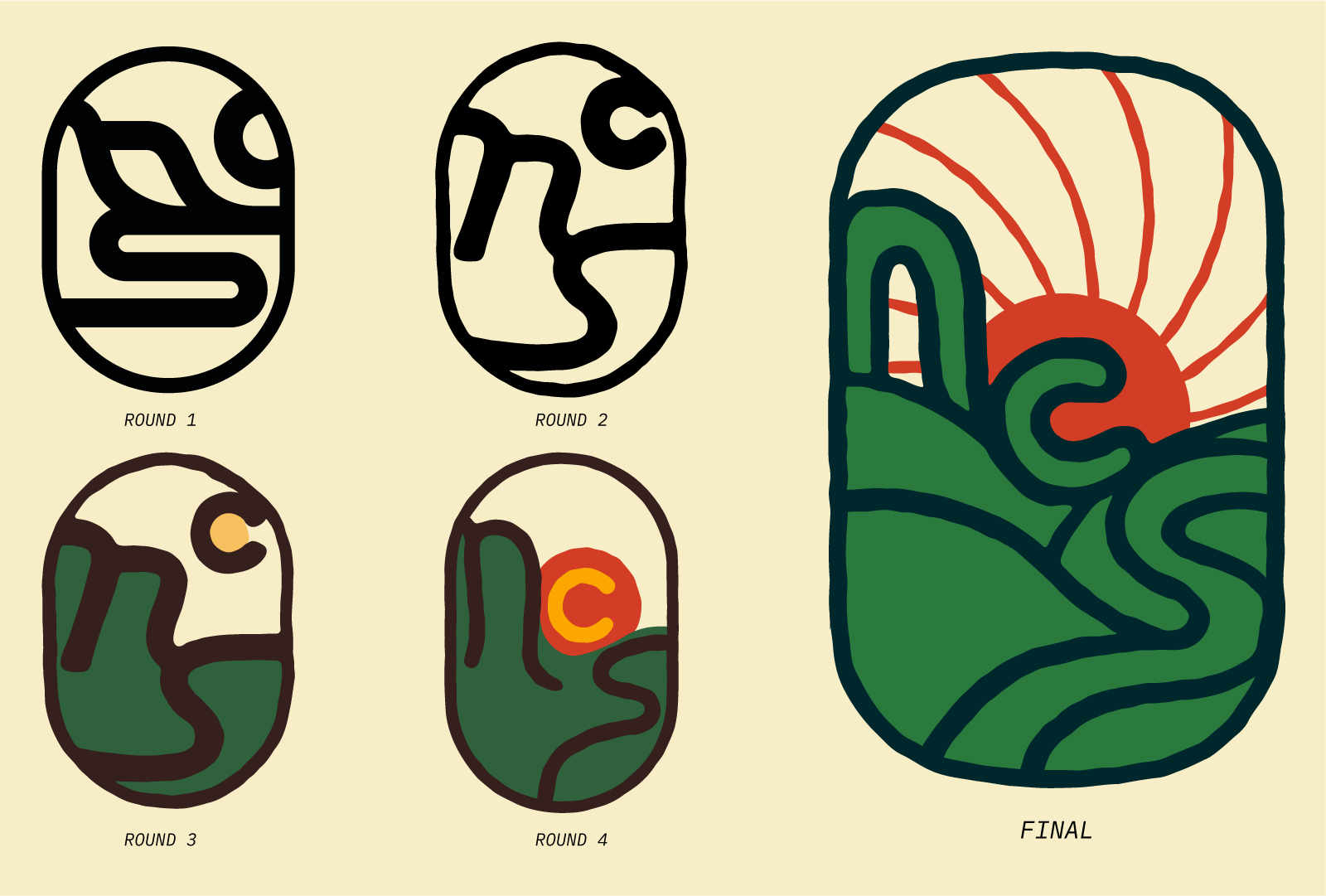
Collaboration exists throughout the branding process, as evidenced by the evolution of the updated NCS icon across the rounds. Incorporating feedback from Isaac and his team, the letterforms were made more apparent, and the sun was made a stronger, more readable element in the logo.
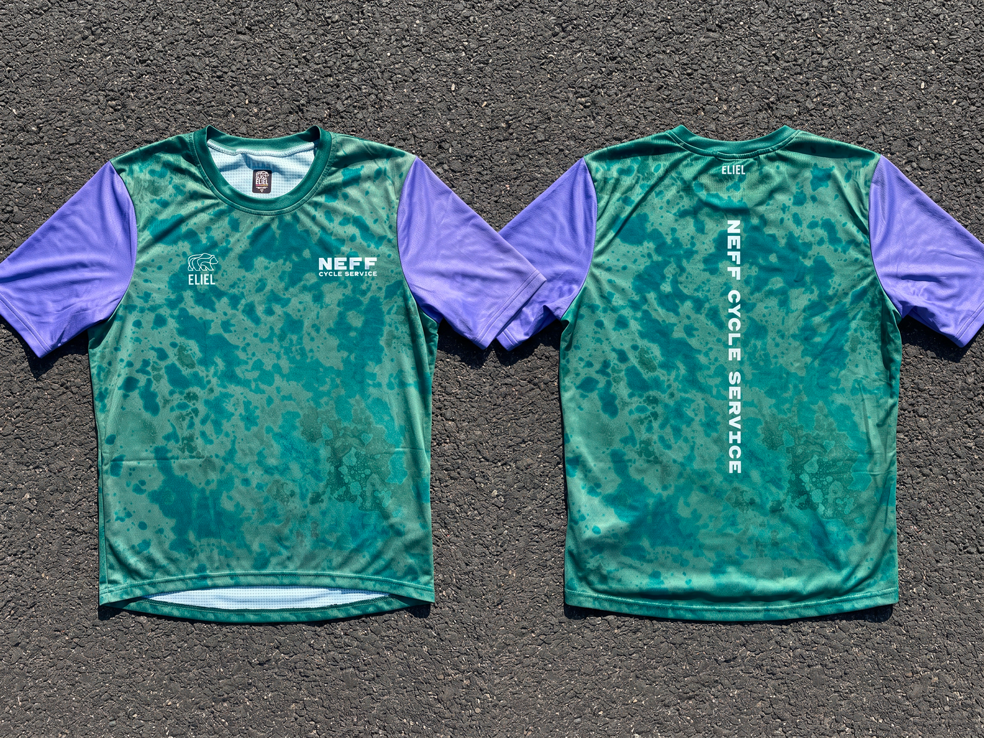
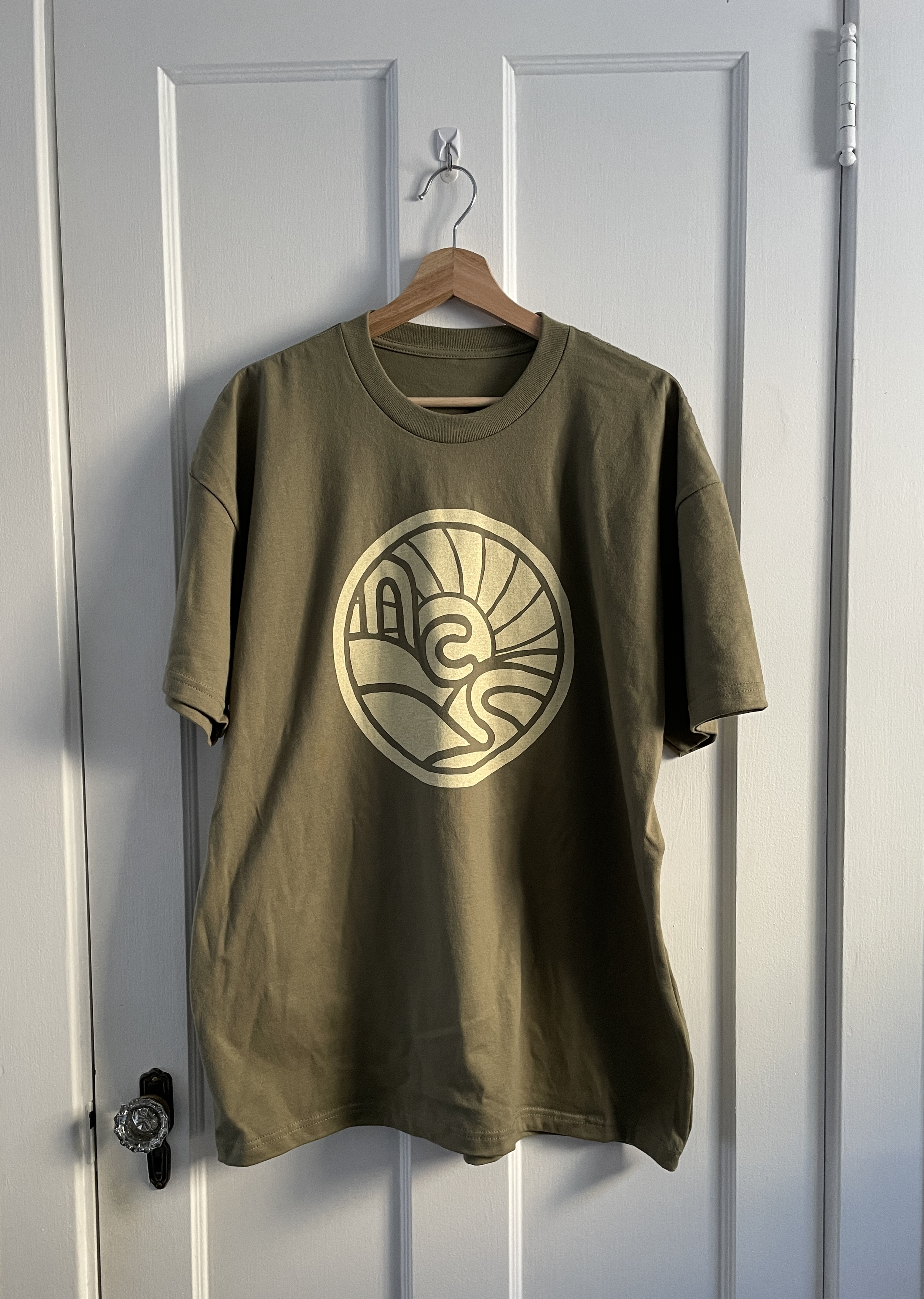
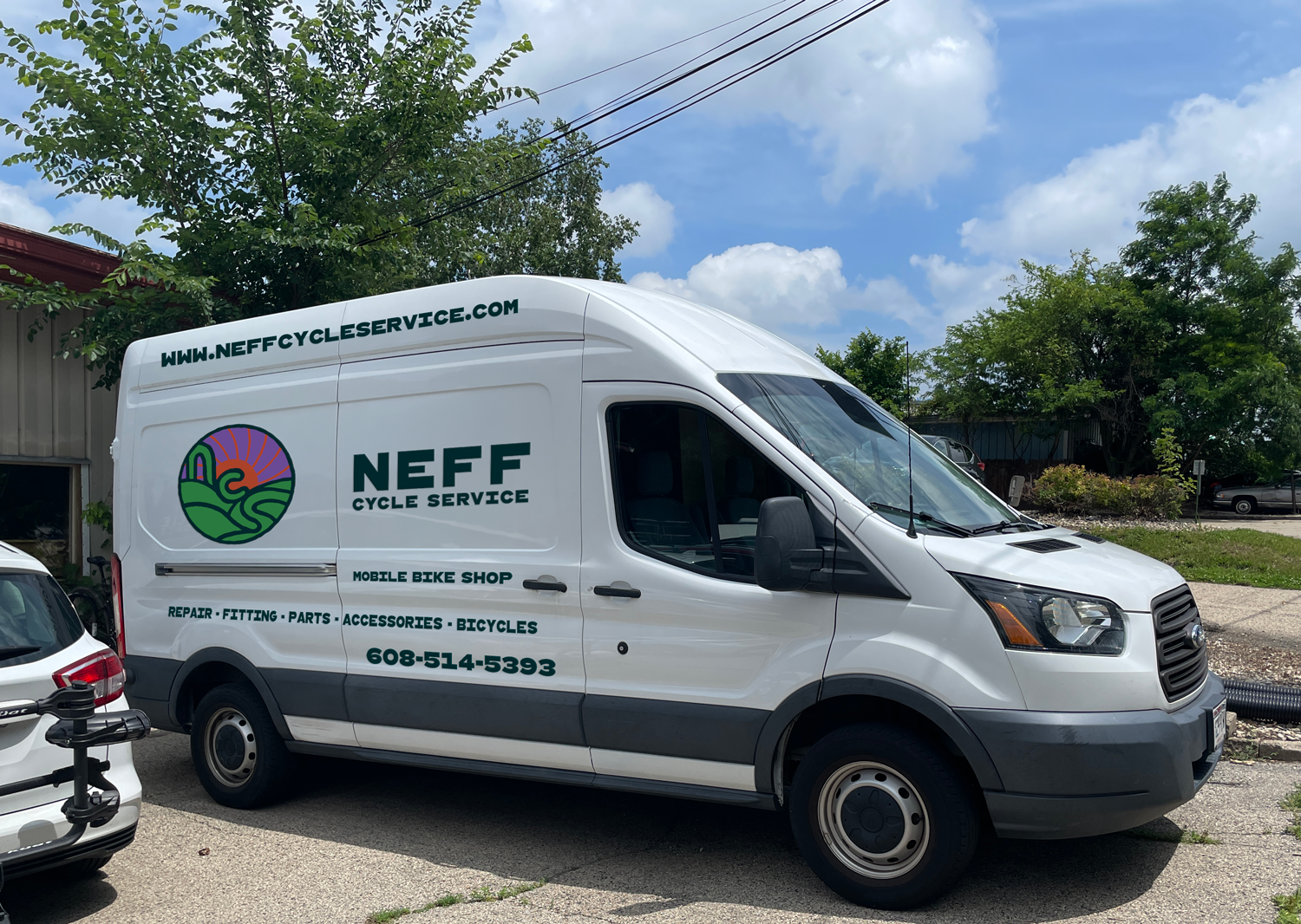
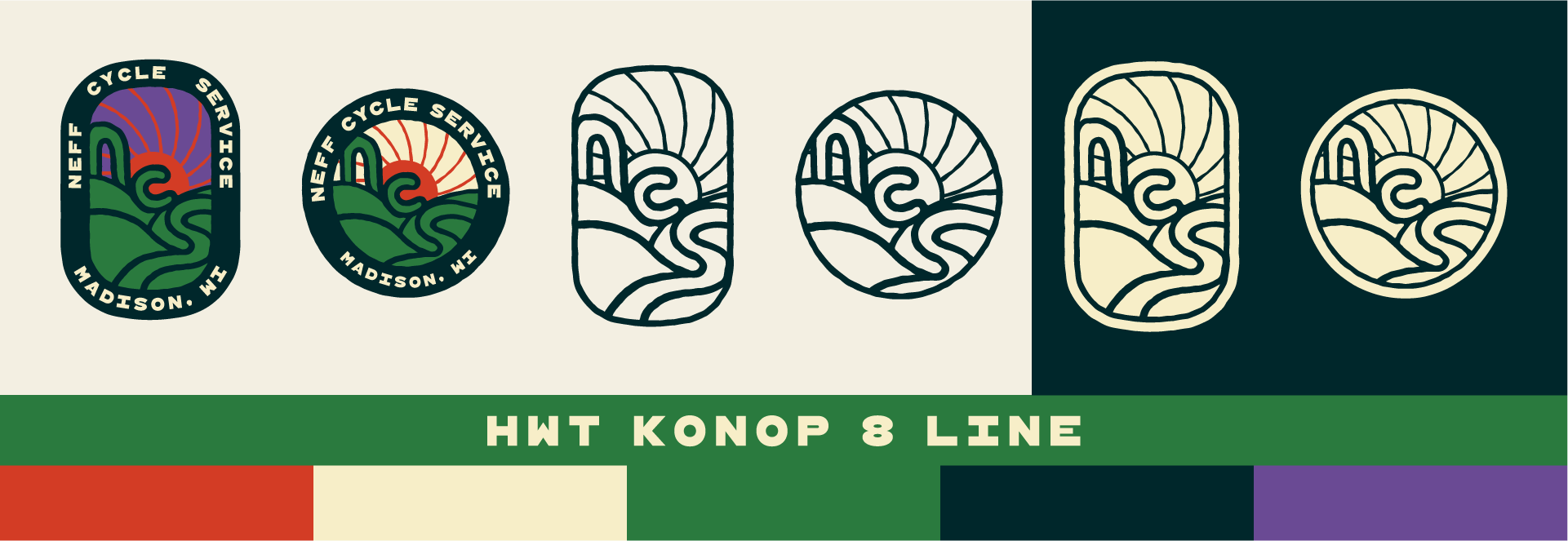
The final package gave Neff Cycle Service both a dusk and dawn version of the logo, expanding the color palette to add a purple and giving the system more versatility across all media.